Optimistic energy balanced with editorial precision. Warm golden light, expressive typography, pages that make people feel something before they read a word.
The Bright & Playful direction is built for food brands, lifestyle product launches, wellness educators, and any business whose energy is fundamentally optimistic. Golden tones. Expressive display type. Joyful but never juvenile.
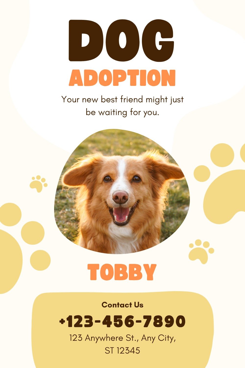
A colorful lifestyle landing page with a different layout language: playful shapes, strong visual entry and energetic hierarchy.
A mobile version that feels light, expressive and brand-ready without looking like a recycled template.