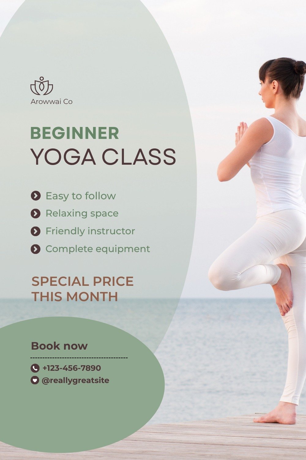
Still. Considered. A measured palette inspired by slow journalism, fine print, and the carefully held silences between good sentences.
The Calm & Editorial direction is built for architects, writers, therapists, independent researchers, and curators. Muted sage and eucalyptus tones. Generous margins. The page doesn't sell — it reveals.
A calm editorial landing-page preview with restrained typography, soft imagery and a trustworthy magazine-like rhythm.
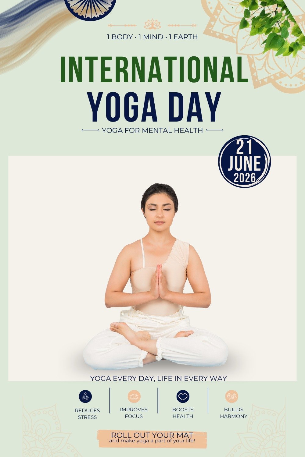
A mobile layout designed around space, clarity and slow premium confidence.