Framegic
Brand identity
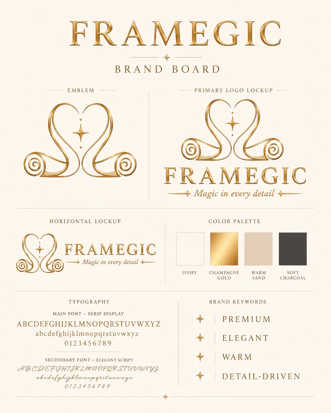
Challenge
Give a boutique hospitality-styling business an identity that feels premium, warm and personal from the first glance.
Concept
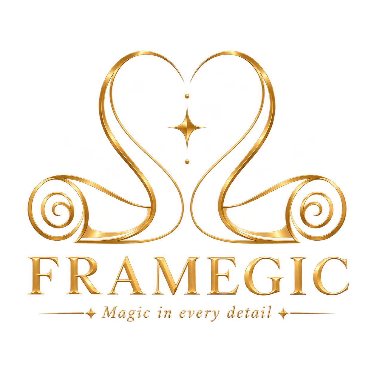
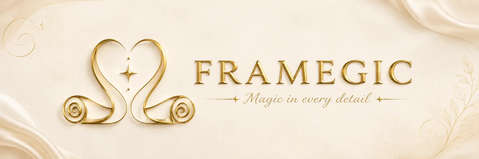
Magic in every detail. The emblem tells the brand's story in one gesture: two swans, their bodies curled like rolled towels, the classic welcome of a thoughtful host, meeting to form a heart.
Creative decisions
Meaning in every element.
The rolled towel stands for hospitality and comfort; the heart for warmth and a personal welcome; the sparkle for the magic of small details; the soft lines for elegance and flow.
A line that guides everything.
“Magic in every detail” became both the brand promise and the test for each application.
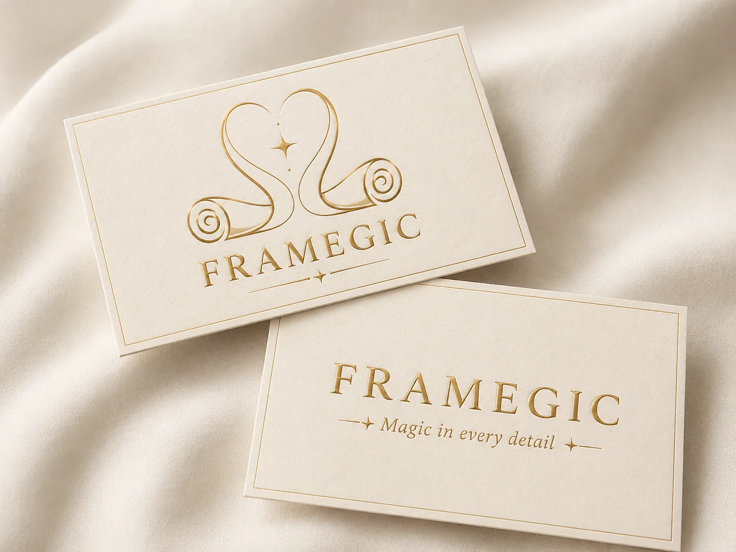
A quiet, luminous palette.
Ivory, champagne gold, warm sand and soft charcoal, paired with a classic serif and an elegant script.
Built to be used.
Primary, horizontal and wordmark lockups in gold, black and white, ready for social, print and screen.
How it was made
Brand concept and symbolism → AI-assisted visual explorations of the mark → selection and refinement → a full lockup system → brand board and applications.

AI-assisted visual explorations of the mark.

Deliverables
- Brand board
- Emblem and lockups
- Symbolism sheet
- Business cards
- Statement and launch cards
- Social profile and cover
Credits
- Brand identity created pro bono for Gabriela by Shahar Dinur.
- Concept, brand development and creative direction: Shahar Dinur.
- Visuals produced with AI-assisted image generation under his direction.